In web design, each color conveys a specific message.
That’s why you shouldn’t choose the color of your website at random.
Red for passion, blue for calm, orange for optimism, green for hope… Here’s what colors mean in communication and web design. 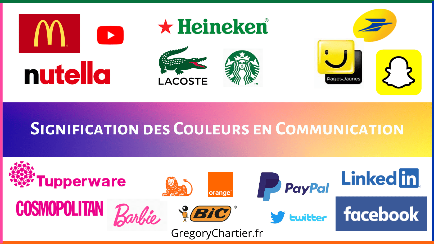
How important are colors in web design?
Beyond its aesthetic role, color is a real communication tool for getting a message across to your audience.
In fact, it can influence web users’ perception of your brand.
As such, the choice of colors for your site should take into account the value of your company and your field of activity.
The meaning of colors in communication
The red
Red refers to fire and blood.
That’s why this color is generally used to express energy, sensuality, passion and love.
As a color no one can resist, red is the preferred choice for call-to-action buttons.
In fact, it’s the color Netflix has adopted for all its CTA (call-to-action) buttons.
It’s a color that easily captures the attention of visitors to a site or e-commerce store.
Red also stimulates the appetite.
That’s why it’s so common in fast-food chains.
The Mc Donald’s logo, for example, combines red with yellow. ![]()
With this bright color, your brand is sure to stand out from the crowd.
The blue
Associated with the sea and sky, blue symbolizes softness, responsibility and assurance.
This color inspires calm, clarity and confidence.
It is often used by institutions that want to show they are trustworthy, such as PayPal, Goldman Sachs and American Express.
As you may have noticed, blue is the most dominant color on social networks (Facebook, LinkedIn, Skype, Twitter and many others).
This can be explained by the fact that this color conveys an image of reliability. ![]()
Companies adopting this color include Dell, HP and Intel.
Associated with calm, blue would also be a preferred choice for sites dealing with subjects revolving around therapy, relaxation and mediation.
Yellow
Like the sun, yellow conveys an image of joy, optimism and dynamism.
Like orange, this color is a sure bet if you want to target a young audience. ![]()
As such, it can be used to highlight a specific element of your site.
For example, an add-to-cart button in an online store.
White
If you want to play the simplicity card, opt for white.
This color also evokes purity.
That’s why it’s perfect for corporate websites in the health and wellness sector.
It’s the best choice if you want to adopt a minimalist design.
What’s more, this color optimizes the visibility of texts on a website. ![]()
Green
Green is often associated with nature, ecology and the environment.
This color is the symbol of growth.
In the United States, green is the color of money.
That’s why it’s also associated with stability.
It is often used to express calm, balance and hope.
Green is the preferred choice of brands that want to show their commitment to the environment.
Like red and orange, green is also the perfect choice for a call-to-action button on a website. ![]()
Purple
Purple combines the passion of red with the calm of blue.
Like black, this color evokes prestige and luxury.
For these reasons, this color would be an excellent choice if you sell luxury products on your e-commerce site.
Purple and romance go hand in hand.
This color is also synonymous with strength, nostalgia and spirituality. ![]()
Orange
Like yellow, orange symbolizes joie de vivre and optimism.
It also conveys a motivational message.
Like red, orange is a powerful tool for capturing the attention of Internet users.
It is therefore an effective color for optimizing a call-to-action button.
Being a dynamic color, orange symbolizes youth.
And the children’s TV channel Nickelodeon understands this.
If you’re targeting a young audience, orange would be a good choice.
It’s also an excellent color if you want to highlight your brand’s creativity. ![]()
Black
In some cultures, black symbolizes mourning and death.
But when it comes to web design, it’s a color that combines elegance and refinement.
That’s why major brands tend to favor this color.
It also inspires seriousness and professionalism. ![]()
Pink
Pink most often expresses femininity.
What’s more, this color is synonymous with softness, romance and naiveté.
It’s the ideal color if your site is particularly aimed at a female audience.
It’s also a bold color if you want to show off your creative flair. ![]()
Brown
Brown reminds us of the color of wood and earth.
This color is generally used to convey a message of stability and express a sense of comfort.
Like green, brown is often associated with ecology.
This makes it a good choice for companies in the environmental field. ![]()
To conclude on the meaning of colors in communication and web design
By now you know that color is far more than just a tool to beautify your website.
Each color expresses a specific message, so don’t take your choice lightly.
As a web design specialist, I can offer you tailor-made support to create a visual identity that reflects your brand.
Please contact me to discuss your web design needs.


