Perhaps you’ve heard of “Responsive Webdesign” and are wondering what it’s all about? If you’re still not sure, read on to find out why it’s become so indispensable.
What is Responsive Webdesign?
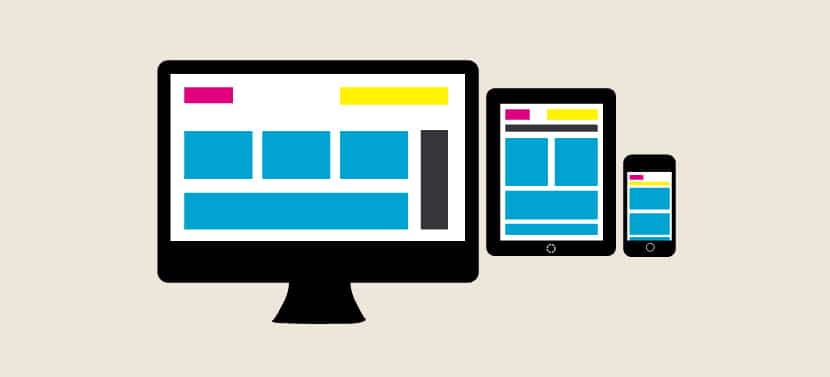
Responsive Webdesign is simply a presentation and layout style that automatically adapts to the medium used by visitors to your site. In fact, imagine a visitor to your site from their computer, and they’ll need to be able to navigate between the different pages of your site easily, whatever browser or screen they’re using. In the past, it was annoying enough to have to scroll to the right to view the entire content if a site was poorly designed for a different screen resolution or browser, but now imagine that this user is going to visit your site not only from their computer, but also from their cell phone, and then from their tablet. In these conditions, screen resolution is no longer the only parameter to take into account; you also need to consider the fact that the screen may be used vertically rather than horizontally, and so on. In addition, menu bars will now have to be used as tactile buttons instead of simply being clicked with a mouse, which implies a design conceived for easy on-the-go use. Responsive Webdesign” means designing a website from the outset for all existing media, rather than simply for reading on a computer, as was the case a few years ago. “Responsive means that your site should react appropriately to the device accessing it.
Going further with Responsive Webdesign?
If you’d like to deepen your knowledge in this field, I can only recommendEthan Marcotte’s excellent book, which covers all the essentials on the subject. In it, you’ll learn why and how to design a site perfectly adapted to all reading modes, whether your visitors are addicted to their phone, tablet or computer. This title will also help you avoid the pitfalls that can come your way when you’re just starting out. In fact, it’s easy to forget to take all possible scenarios into account and, to remain perfectly exhaustive, you need to plan your site’s architecture clearly well before you start writing any lines of code. Never forget that efficient navigation is the key to avoiding a ridiculously high “bounce rate” and to keeping your visitors coming back for more!
Which reading medium to choose first?
Do you want your site to live on and generate significant traffic? Then a “mobile first” responsive webdesign approach is absolutely essential. It’s a fact that today, more and more people are consulting the Internet on a cell phone, and increasingly on a tablet. With the festive season just around the corner, and the prices of tablets and smartphones becoming more and more reasonable, it’s clear that the proportion of Internet users consulting the web from a touchscreen can only increase. In these circumstances, it’s essential to give priority to reading on these devices, even before thinking about reading on a PC or Mac! Furthermore, it seems logical to design a site first and foremost for the smallest screen on which it will be viewed, as it is this version that is likely to cause the most problems. Once the mobile site is complete, it’s easy to test it on the PC to see if everything also works as expected.
Why opt for responsive web design (RWD)?
The current trend clearly shows an increase in mobile browsing, and this is unlikely to change. And since more and more websites are consulted while on the move, it’s also clear that an unattractive site on a cell phone is likely to pay the price in terms of traffic, including on a computer. While many Internet users still use their computers, they will soon prefer to visit sites that offer a more pleasant reading experience from the comfort of their sofa in the evening after work, or on their mobile on public transport on the way home. And if you’re designing an ecommerce site, this is even more important to bear in mind: if purchases are too complicated to make on a tablet or phone, there’s a good chance that Internet users will turn away from your site to shop at your competitor’s! You only have to visit the sites of the leading online retailers to be convinced of the strategic importance of the mobile sector… Especially as cell phone use lends itself much more to impulse buying! Who wants to spend hours shopping on a computer when purchases can be made quickly from a phone? Thank you Responsive Webdesign!
In conclusion, what can we learn from responsive web design?
First and foremost, a mobile site must be able to load extremely quickly. Never forget that, whatever the connection mode (3G/4G/Wifi), a mobile surfer will lose patience if the site doesn’t offer comfortable, fast browsing. So: beware of unoptimized videos or images, they could cause you problems. Go for the essentials in terms of content, and opt for a streamlined style from the outset, without imposing unnecessary steps on your visitors. As for the rest, be sure to test your site on as many different media as possible, because with responsive webdesign, you’re never safe from unexpected bugs!


