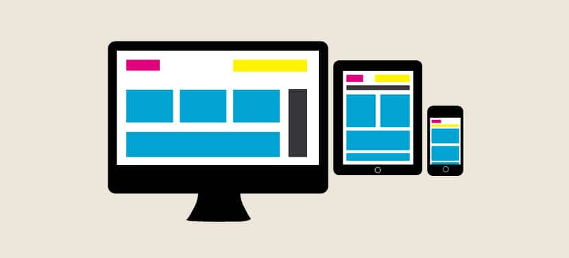
Responsive design is a web development approach that enables your PrestaShop store to automatically adapt to all screen sizes. This technique ensures optimal user experience whether your customers browse from smartphones, tablets, or desktop computers. With over 60% of online purchases now made on mobile devices, mastering responsive design becomes essential for maximizing your sales.
This technology represents much more than simple visual adjustment. Therefore, it constitutes a genuine growth lever that directly influences your conversions, search rankings, and customer satisfaction.
Why is responsive design crucial for your PrestaShop store?
Mobile commerce explosion
The numbers speak for themselves: more than 6 out of 10 online purchases are now made from mobile devices. This trend accelerates yearly, particularly among younger consumers. Thus, they prefer smartphones to compare prices, read reviews, and complete purchases.
Google ranking impact
Google severely penalizes non-mobile-optimized sites since transitioning to “mobile-first indexing”. Specifically, the search engine now uses your site’s mobile version. Therefore, it evaluates relevance and determines rankings accordingly.
Well-implemented responsive design gains major competitive advantage in search results. Conversely, a PrestaShop store not adapted for mobile risks disappearing from Google’s first pages. Consequently, this deprives your e-commerce of free, qualified traffic.
How does responsive design work in PrestaShop?
Flexible grids and breakpoints
Responsive design relies on flexible grids using percentages rather than fixed dimensions. Your PrestaShop layout stretches or contracts according to screen width. Thus, it always maintains harmonious proportions.
Breakpoints define thresholds where your design reorganizes. For example, your product grid changes from 4 columns on desktop to 2 columns on tablet. Then, it displays 1 column on smartphone. These transitions occur automatically without your intervention.
Automatic PrestaShop content adaptation
All elements of your PrestaShop store transform intelligently based on the device used. Your main menu becomes a hamburger button on mobile. Additionally, product images resize without losing quality. Checkout forms also optimize for touch input.
This adaptation also covers PrestaShop-specific e-commerce features: mobile payment integration, touch zoom on product photos. Nevertheless, catalog navigation remains simplified.
Business benefits of responsive design for e-commerce
Conversion rate improvement
Studies show mobile conversion increases between 15% and 25% after responsive design implementation. This improvement stems from removing friction during the purchase journey. Thus, customers navigate more easily and find information quickly. Moreover, they complete orders without frustration.
Each optimized step translates to more sales. An “Add to cart” button properly sized for touch can increase conversions by several percentage points. Consequently, responsive design investment pays off quickly.
Bounce rate reduction
Responsive design maintains mobile visitor attention. However, they immediately leave poorly adapted pages. This bounce rate reduction not only improves organic search rankings. Additionally, it increases time spent on your PrestaShop store and pages viewed per session.
Maintenance savings
Unlike separate mobile versions, responsive design uses one codebase for all devices. This approach considerably simplifies PrestaShop store maintenance. Thus, every modification, new product, or promotion automatically applies to all versions.
You save on development costs. Nevertheless, you guarantee perfect consistency across different sales channels.
How to verify if your PrestaShop store is responsive?
Several free tools enable quick mobile compatibility testing of your PrestaShop site. Google’s “Mobile-Friendly” test analyzes your page in seconds. Moreover, it identifies potential issues. For visual verification, simply resize your browser window. You can also use developer tools to simulate different devices.
Remember to test your PrestaShop store on real mobile devices. Actual user experience may differ from simulations. Particularly verify loading speed and navigation ease through your PrestaShop checkout process.
Responsive design vs mobile app for PrestaShop
For most e-commerce merchants using PrestaShop, responsive design represents the most cost-effective solution. It costs significantly less than native mobile applications. However, it benefits from Google indexing and maintenance simplicity.
Mobile apps better suit large retailers with substantial budgets. Additionally, they require loyal customers willing to download apps. To grow your PrestaShop e-commerce business, prioritize responsive design first. Thus, you can consider complementary applications later.